Unseen Text: We Are Humber
Text Type: Recruitment Poster / Banner
Guiding Question: How do formal features of layout, visuals and copy combine to persuade the audience in this campaign?
Persuasion in one form or another is an element of many mass media texts. You may find yourself studying all kinds of texts and topics in order to learn the language of persuasion: speeches, emotive appeals, adverts, even propaganda posters from the past. It’s unlikely you’ll cover all the possible types of persuasive text; so something you may have to do when you’re sitting Paper 1 is to transfer your learning from other parts of the course into this exam. This is especially true if the text type you are given is unusual like this colourful ‘banner’ that you might encounter at a recruitment fair. Once you’ve recognised this as a recruitment campaign, you should be able to analyse how the formal features (in this response, visuals, slogan, and copy) are designed to tap into timeless appeals such as the need to achieve or affiliate. Of course, the response you can read below is only one way of approaching this text: alternative answers can be equally valid:
Sample Response:
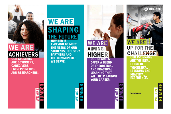
The given text is a recruitment poster for Humber University aimed at encouraging students to enrol on one of the University’s courses. The campaign is mainly aimed at the demographic of students wanting to attend university and is designed to appeal to students through positive representation of young people, the need to achieve in future careers, and the suggestion that by joining Humber University you will be joining a community of like-minded people – all presented in an eye-catching ‘banner’ design.
The poster uses positive images of young people to represent the target audience and symbolise what a ‘Humber experience’ can be: engaging, dynamic, and practical. The girl on the left is smiling, and so are the pupils behind her in the background. The depth of the image suggests the classroom is busy, full of happy learners, while the focus remains on the girl in the front, emphasising her smile. The image in the third panel is of another girl, this time she looks concentrated and focused. The angle of the image suggests she is listening to someone just out of the frame of the image, as if inviting us to participate as well. Again, the depth of the image shows there are other students similarly engaged. The photo on the right shows a young man experimenting with a robot arm. He looks focused on his project, and there is obvious excitement in this image; robotics is a modern and dynamic field and is a practical way to study engineering, design, programming and so on. The posters want the audience to know that an education at Humber is not just listening to lectures: the word ‘practical’ is repeated in the copy. The models chosen for these images are diverse: there are two girls, and all three students are from different ethnicities, ensuring the poster will appeal to a wide demographic. Overall, the different images of happy students appeal to would-be applicants – any person attending Humber University will be dynamic, engaged and happy.
The poster supports and develops the positive images of engaged students through slogans that appeal to the viewer’s need to achieve as well as the need to affiliate. For example, the phrase ‘We are…’ is repeated in all four banners. The personal pronoun‘we’ is inclusive, and makes the reader feel like they will be joining a community of likeminded people. The slogan is declarative and asserts the students at Humber have a range of positive attributes like ‘achievers’ and ‘up for the challenge.’ All four slogans have the common theme of ‘ambitious,’ leaving the audience in no doubt that the university will foster and develop a sense of ambition in a potential student. Furthermore, these words are examples of glittering generalities – it would be hard for a reader to disagree that ‘fulfilling ambition’ is a fundamental reason for going to university. The repetition of ‘We Are Humber’ at the bottom of each poster, rotated ninety degrees to complement the ‘hanging banner’ design, unambiguously associates the university with each of these positive and glittering values. Overall, the appeal to affiliate with a group of likeminded students who are all ambitious to achieve comes through strongly from the slogans on this poster.
These appeals are supported by extra copy and certain compositional features, which combine to amplify the emotional appeals. For example, underneath the heading the copy reads, ‘Humber is evolving to meet the needs of our students, industry partners and communities we serve.’ The idea of a university ‘meeting the needs’ of its students reassures the reader, making them feel secure as they are at the centre of the university’s mission, and the tri-colon puts weight on the word ‘communities’, developing the inclusive feel of the campaign. Phrases like‘Shaping the future’ and‘evolving’ are effective in suggesting the university is modern, dynamic, and a hub of innovation and development. The third panel explicitly states that an education at Humber will ‘help launch your career.’ The word ‘launch’ has been chosen for its positive and powerful connotations, as if Humber will give you the fastest possible start in life or provide ‘lift-off’ to your career. The copy in the first panel includes a list of possible career paths including ‘designers, caregivers, entrepreneurs and researchers.’ One effect of a list is to create the impression that there are more possibilities just round the corner. In these subtle rhetorical ways, the text amplifies the positivity of the poster’s messages, and broadens the appeal to a diversity of potential future students.
In conclusion, this text is a perfect example of an effective recruitment campaign that has been designed to connect with young people. It is inclusive, modern, colourful, and represents students in a positive way. It may be short on details – no statistical evidence is offered, for example – and it certainly employs card-stacking to make university life seem happy and stress-free. Yet the bold design and rhetorical flourishes tap into both the ambitions of young people, and their desire to be part of a diverse, positive, and like-minded community.
Categories:Paper 1 Analysis

interesting.
LikeLike
a
LikeLike