Unseen Text: The Smith Family
Text Type: Charity Appeal – Advertisement
Guiding Question: How do features such as layout, fonts and visuals help support the argument?
Charity appeals are a sub-genre of advertising and, as such, you can easily transfer your learning about advertising techniques – especially persuasive techniques – onto appeals. The topic of a charity appeal could be anything from homelessness, to famine, to refugees from war, animal adoption, and more. As a reader, it’s impossible to believe that you, one individual, can solve crises such as hunger, poverty or sickness. But it’s very easy to believe that you can help a particular individual out of a dire situation. Charity appeals are aware of this, and often introduce you to a victim of suffering, giving you a bit of information about their life and family background, and explaining that the situation they are in is out of their control. In this way, the appeal creates that empathetic connection you need in order to take action. Read the response below, and look how you can use this knowledge as a starting point to develop a persuasive analysis of your own. Once again, a reminder: this is only one of many possible responses to this text. Alternative approaches can be equally valid.

Sample Response:
The given text is a charity appeal produced by the Smith Family, an Australian organisation that supports poor children. The values of the organisation are made clear: they believe that education is essential to ‘prevent a lifetime of poverty’, therefore they focus on providing educational materials such as schoolbooks and promoting access to education for children of poor families. The purpose of the text is clearly persuasive; the whole point of this campaign is to persuade the reader to donate money to the Smith Family; large, red ‘Donate Now’ buttons are located in four separate areas of the text, making it easy and simple for a reader to click at any time. The text is designed to appeal to the average Australian reader, a wide audience who may have disposable income to donate to help ‘disadvantaged children in Australia.’
The text uses an image of ‘Jenny’, an individual facing the challenge of poverty, in the hopes of appealing to the need to nurture. She is introduced in the caption as ‘Jenny, aged 8,’ her young age being used to activate protective instincts in the reader. Accordingly, the most prominent image of Jenny is splashed across the top of the page, and immediately draws the reader’s attention through size. The accompanying caption is a testimonial by Jenny saying:‘I don’t want to be poor’. ‘While ‘poverty’ is an abstract concept, the focus on Jenny and hearing her direct address is designed to make viewers feel they can help this girl. The image presents Jenny surrounded by buildings and other children in school. However, Jenny is isolated in the foreground where the school and other children are out of focus in the background, a technique which suggests she has no way of joining in with their games. Her body language is muted, in contrast to other children who are in a range of active poses, and her facial expression is negative. This reading of the image is anchored by the caption which tells us that ‘it is obvious to her classmates Jenny is poor, and they don’t let her forget it. She has no friends and often feels lonely.’ Loneliness is an emotive issue and the idea of a child being ‘lonely’ and vulnerable is unpleasant. Jenny makes direct eye contact with the reader, as if her only link is with ‘you’. The image and caption are designed to create this connection and therefore increase the chance that the reader will want to help by donating to the appeal.
The text employs emotive language to build on Jenny’s vulnerability and amplify the appeal to a reader’s need to nurture by wanting to rescue Jenny from harm. The first states ‘being poor hurts. Everyday Jenny struggles in the classroom. She feels isolated and alone.’ Words such as ‘isolated’, ‘alone’, ‘struggle’ and ‘hurts’ are all emotive and intended to make the reader feel sorry for Jenny. The second subheading fleshes out the story of poverty: we learn ‘Jenny’s family have no money.’ Both these subheadings are presented in bold, dark blue font, all the better to catch a quick reader’s attention and encourage him or her to read the associated paragraphs. Each paragraph adds a little bit more to Jenny’s story, relying almost entirely on the emotions of pity for Jenny’s tragic circumstances. We discover Jenny’s mother is ‘too ill to work’, and the text repeats ‘with an ill mother’ to drive home the point that poverty is not Jenny’s fault. Jenny’s isolation is reiterated (‘Jenny can’t participate like other children. It means she misses out…’) and the word ‘hurts’ is repeated as well. Each paragraph of copy deepens and intensifies the emotional connection with Jenny, hopefully ensuring as many people as possible donate to help her cause.
Having established an emotional connection, the text uses a ‘call to action’ to leverage the readers’ emotion into action. For example, The third subheading reassures readers that they really can make a difference: ‘Children like Jenny urgently need your help. You can change their lives…’ The word ‘urgently’ is an example of kairos, the appeal for swift action, which demonstrates how the text is changing its strategy towards urgency of action. From this moment on direct address (‘you’) becomes a feature, in examples such as ‘you can help disadvantaged children’ and ‘it is absolutely crucial that we give them the support that they need.’ The subtle switch from ‘you’ to ‘we’ is important. A reader might believe that acting by themselves will make no difference, but by pooling their resources with other generous readers they can help Jenny out of her situation. Modals such as ‘can’ and ‘will’ are strong and positive, creating the impression that the problem can be solved by the reader: ‘you can…’or ‘we can…’ is repeated four times, and at one point highlighted in red. Overall, the combination of a call to action with compositional features draws the readers’ attention to the idea that action is necessary to help Jenny – and that a happier end to her story is achievable.
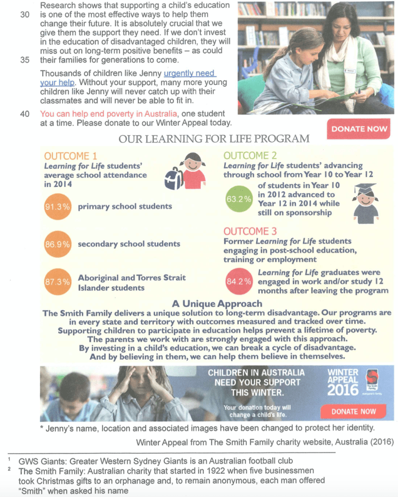
Therefore, the text also employs rhetorical contrasts to show the impact of donations in turning the tide of poverty. For example, the sentence ‘By investing in a child’s education, we can break a cycle of disadvantage’ creates a cause-and-effect relationship between the reader’s action and a positive outcome through the implied pattern ‘If… then…’ : If you provide the donation for the investment, then we can ‘break the cycle.’ The word ‘break’ is dramatic and strong, further reinforcing the dramatic impact on people’s lives a reader can have through donation. The sequence of images reflects this pattern. While the first three images present the desperate situation of poverty, the fourth image shows a positive and healthy relationship between a teacher and pupil. The final photo has been designed to contrast with the others in colour – washed-out blue represents poverty while this picture contains warm green – and saturation; it is noticeably brighter and warmer in tone. Ultimately, the text uses both visual and verbal rhetorical contrasts to show the reader that the mission of the Smith Family is achievable in a concrete way.
In conclusion, the text persuades the reader that, through donating to the Smith Family programme, lives of children in poverty can be improved. Through the focus on a single individual (Jenny) the issue is reduced to a manageable size for readers. The move from emotional appeal to a concrete call to action is reinforced by contrasting images showing positive outcomes. All of this is supported by authoritative language promising authenticity. Phrases like ‘research shows…’ give the claims of the appeal more credibility. Details such as ‘our programs are in every state and territory with outcomes measured and traced’ suggest organisation and effectiveness on the part of The Smith Family; they know what they are doing and your money will not be wasted or misused.
Categories:Paper 1 Analysis
